Why every AI website looks the same (and 9 fixes that work)
By The WAALEE Team · · 7 min read
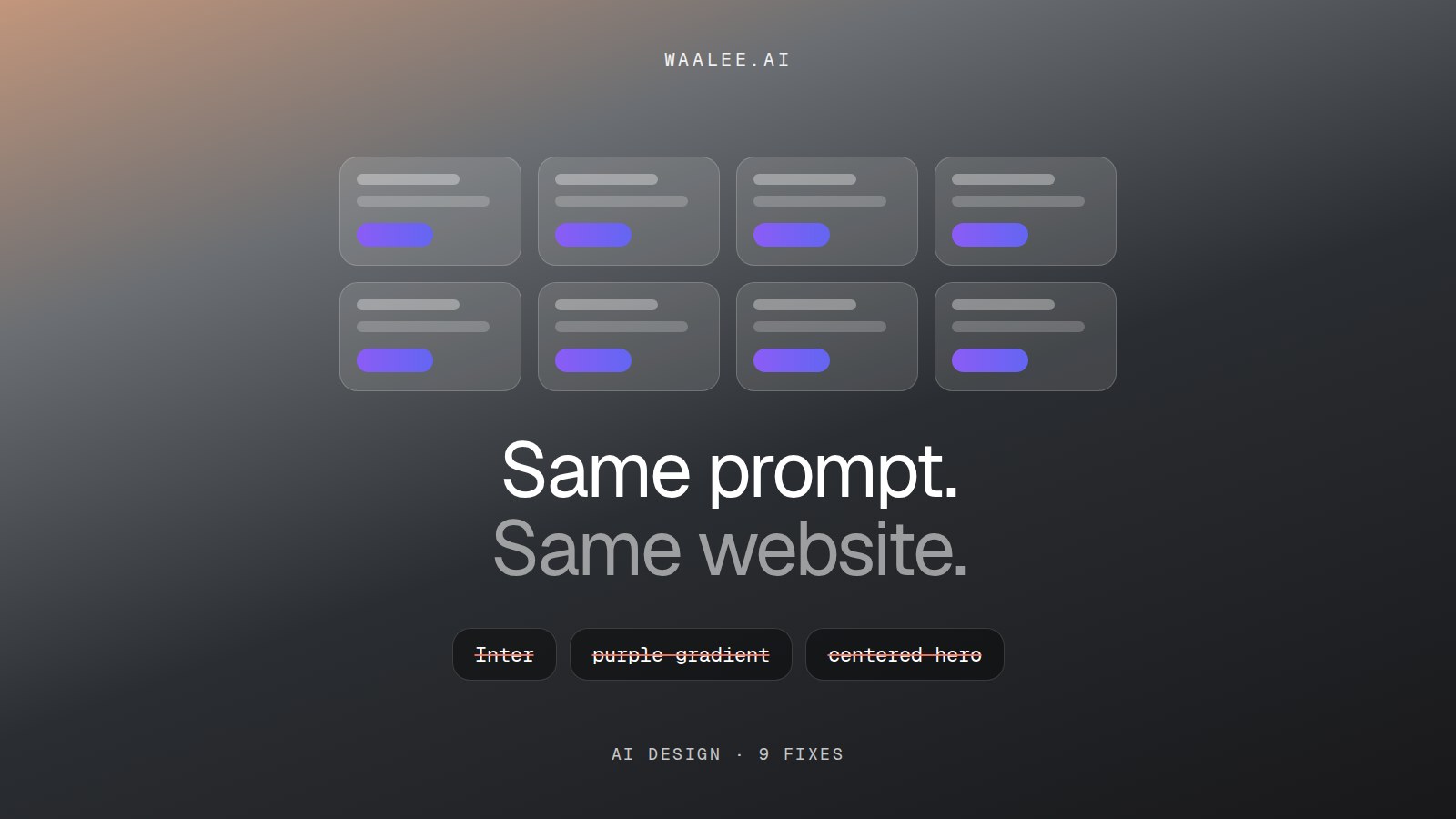
Open five sites built with AI this month and you'll see one site. Inter, or whatever the default font is that week. A centered headline over a soft purple-to-blue gradient. Three rounded cards with an emoji each. A r/SideProject thread asks the question directly, and Unpromptable put it plainly: "Most AI-built websites look the same because most people skip the identity work and accept AI's defaults."
Why it happens
An AI builder has to decide hundreds of small things: font, size, spacing, corner radius, shadow, color, layout. If your prompt says "make it modern and clean," it decides almost all of them for you, using the safest answer it knows. The safest answer is the most common one. So every site gets the most common design on the internet.
- The default font, at every size, for everything.
- The component library's stock look: gray borders, rounded-xl cards, untouched spacing.
- A purple or blue gradient that has nothing to do with any brand.
- A centered hero, three feature cards, a pricing table, a FAQ. Always in that order.
- Emoji standing in for real icons.
9 fixes that work
- Collect references before you prompt. Save 10 to 15 sites you love from Awwwards, Dribbble, Behance or your competitors. Taste is the input the AI can't invent for you.
- Give exact values, not adjectives. "Background #0b0b0c, text #f5f5f4, accent #ff5a1f, 8px radius" beats "dark and bold" every time. These values are your design tokens.
- Pick a real font pairing. One display font with character and one plain text font. Name them in the prompt and say where each one goes.
- Choose one accent color and use it sparingly. One brand color on buttons and links, neutrals everywhere else. Ban gradients unless your brand actually has one.
- Sketch the layout first. Even a rough drawing of section order on paper stops the AI from defaulting to hero, three cards, pricing.
- Start from real components. Libraries like 21st.dev and agent skills from skills.sh give the AI better building blocks than its stock ones.
- Write a design file the AI reads every time. A DESIGN.md or rules file in your project keeps the look consistent across every new page and every new chat.
- Change one thing per prompt. "Make it better" rewrites everything. "Tighten the hero spacing to 96px top and bottom" fixes one thing and keeps the rest.
- Treat the AI as a collaborator, not a vending machine. Look at what it made, say what's wrong in specific terms, and iterate. Two or three rounds is normal.
A prompt template you can copy
Paste this into Lovable, Bolt, v0, Cursor or Claude and fill in the brackets. The more exact the values, the less the AI guesses.
- Style reference: [site you like], match its overall feel, not its content.
- Colors: background [hex], surface [hex], text [hex], muted text [hex], accent [hex] (buttons and links only), border [hex].
- Fonts: headings [font, weight], body [font, size, line height].
- Shape: corner radius [px], borders [1px, color], shadows [none / soft].
- Spacing: section padding [px], content max width [px].
- Layout: [your section order]. No gradients, no emoji icons, no centered-everything.
| Prompt with adjectives | Prompt with a spec | |
|---|---|---|
| Font | Whatever the default is | The fonts you named |
| Colors | Purple-blue gradient | Your palette, one accent |
| Buttons | Stock component style | Your radius, padding and color |
| Layout | Hero, 3 cards, pricing | Your section order |
| Next page | Drifts to a new look | Matches, because the spec is reused |
What people suggest
Commenters on the r/SideProject thread point to different prompts, layout systems, design tokens and seed-based variations as ways to break the generic look.
r/SideProject
Unpromptable's five tips: develop taste, work with pre-existing assets, build your own assets, sketch before you prompt, and treat AI as a collaborator.
Unpromptable
People asking which AI is best for websites often find the tool matters less than they hoped: every one they try gives a similar-looking result.
r/vibecoding
The shortcut: take the spec from a site you already like
Fixes 1, 2, 3, 4 and 7 are the slow part: finding the exact hex codes, fonts, spacing and button styles of a site you admire, then writing them up. That's the step WAALEE does for you. Paste a URL, and it reads the live site and gives you its real colors, fonts, spacing and components as a prompt and a DESIGN.md file, ready for whichever builder you use. Use it on your own site to keep new pages on-brand, or on a reference site for inspiration. Then make the content, the logo and the voice your own.
Three good places to start fixing a generic AI site:
- Unpromptable: 5 AI website design tips: A clear essay on doing the identity work first: taste, references, sketches, and when to hire a designer.
- 21st.dev: A large library of community UI components with copy-paste prompts, so the AI starts from better building blocks.
- WAALEE: Paste any live site and get its real design system (colors, fonts, spacing, components) as a ready prompt for Lovable, Bolt, v0, Cursor or Claude. Free to try.
Why do AI-generated websites look generic?
Because the AI fills every design decision you don't specify with its most common default. Same defaults, same site. Give it exact colors, fonts, spacing and layout and the output stops looking generic.
How do I make my Lovable or Bolt site look better?
Give it a design spec instead of adjectives: hex colors, named fonts, a corner radius, spacing values and a section order. Keep that spec in a file the tool reads on every prompt, and change one thing at a time.
What are design tokens, in plain words?
They're the exact values that make up a look: colors, font sizes, spacing, corner radius, shadows. Written down as names and values, so a person or an AI can reuse them the same way every time.
What is "AI slop" design?
A nickname for the default look AI tools produce when nobody guides them: the stock font, purple gradients, centered heroes, emoji icons and identical cards. It isn't broken, it's just everyone else's site.
Do I need a designer to fix an AI-built site?
Not always. References, a clear spec and a few rounds of focused prompts get most sites from generic to decent. For a brand identity (logo, voice, a distinctive system), a designer is still worth it.
Can I copy another website's design with AI?
Use other sites for inspiration and style, not as something to clone. Matching a feel (spacing, type scale, color mood) is normal design practice. Copying logos, images, text or a trademarked look is not.